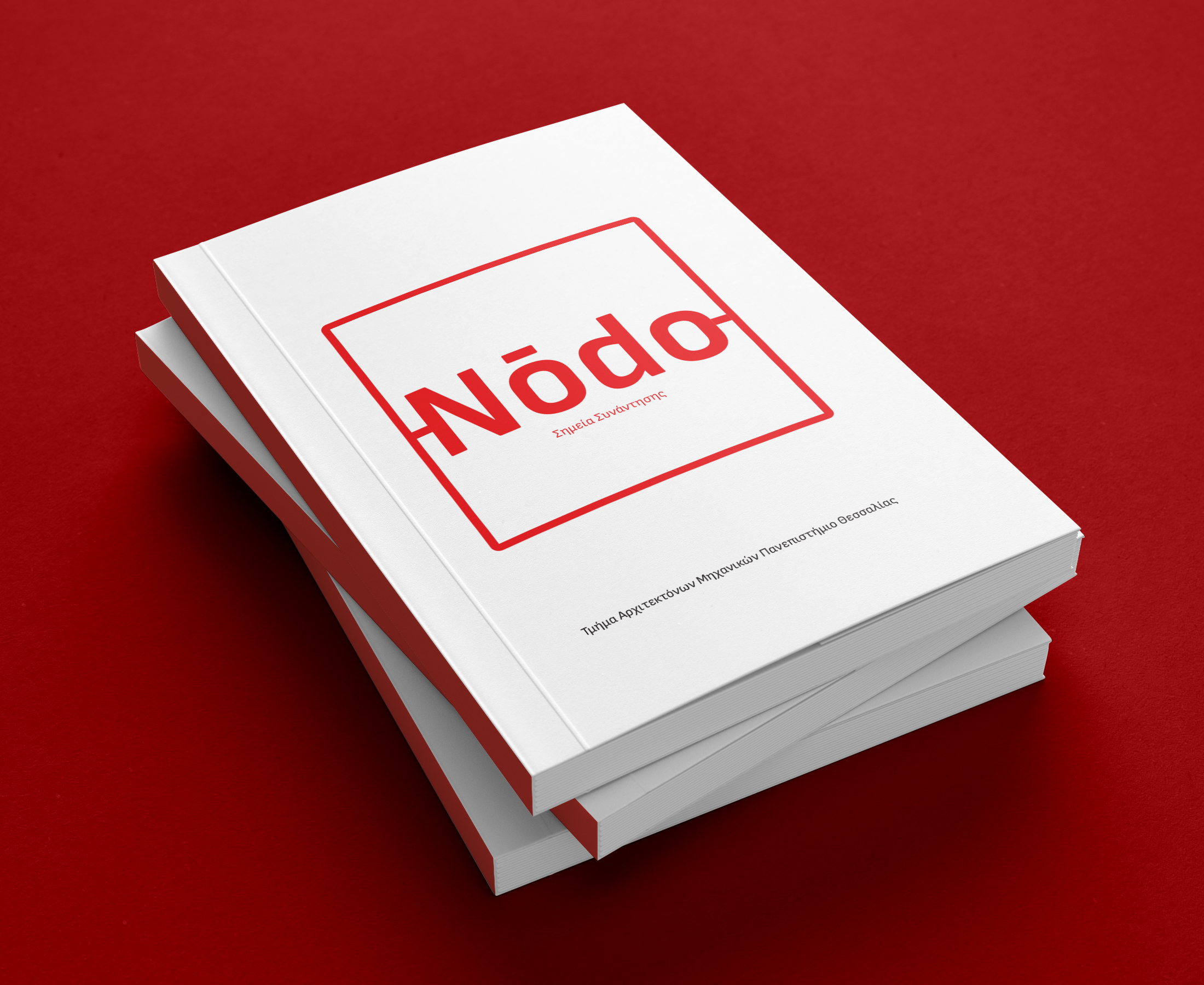
Nodo | book design
diploma thesis
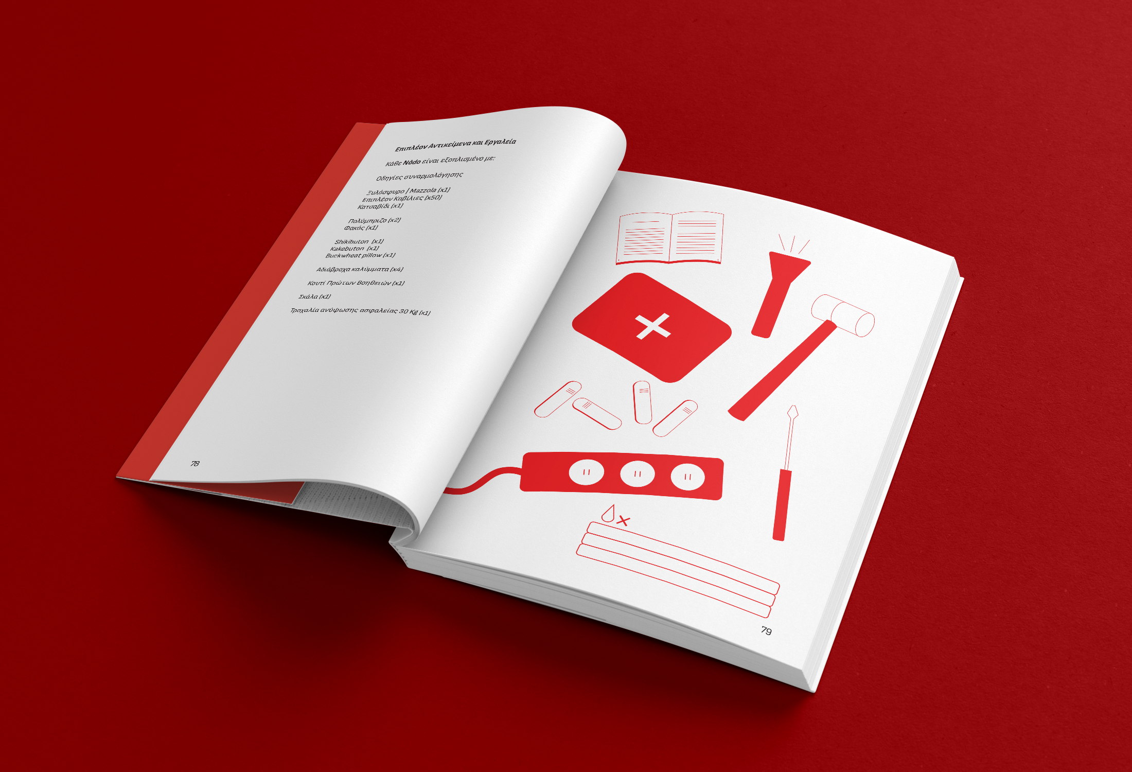
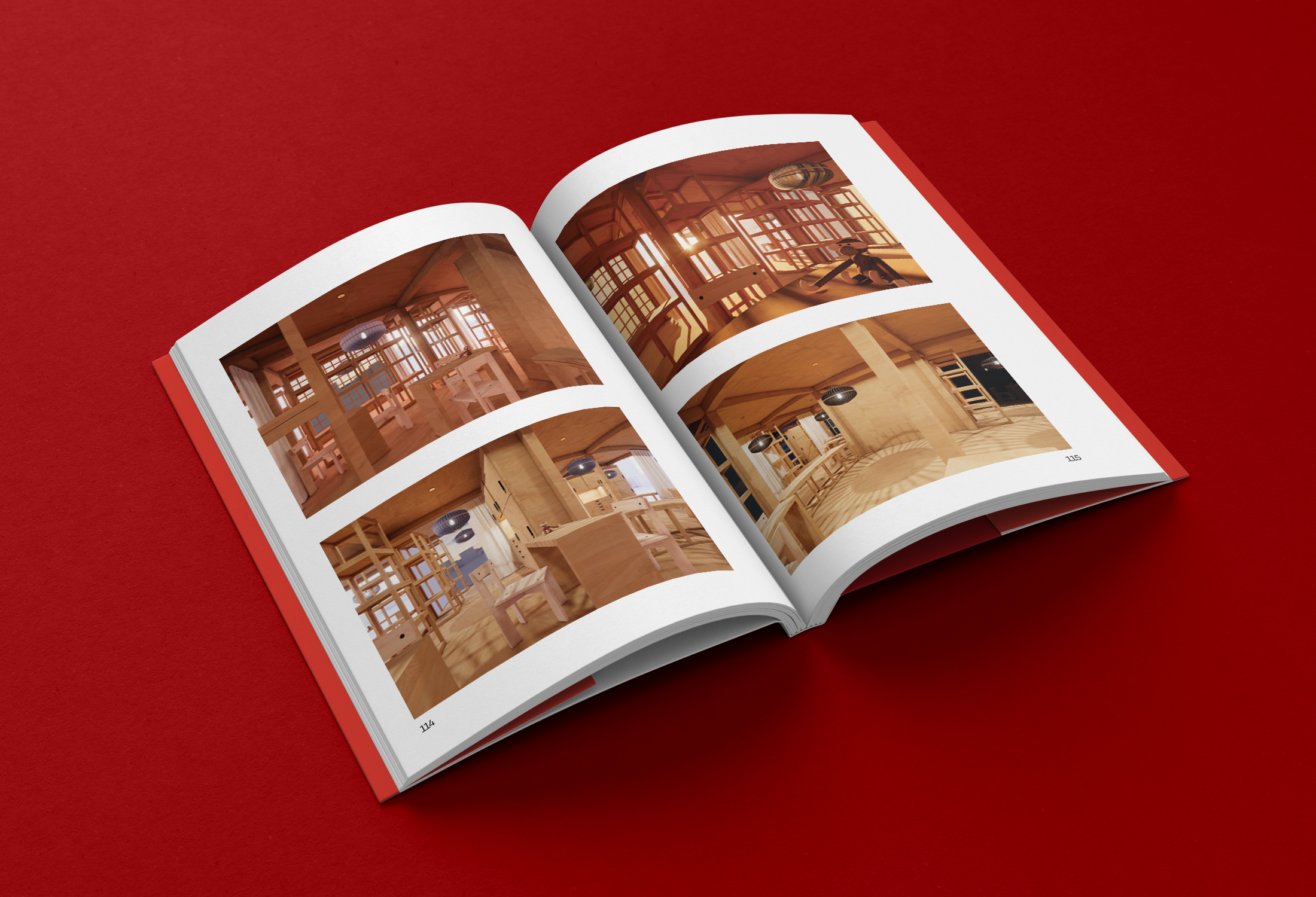
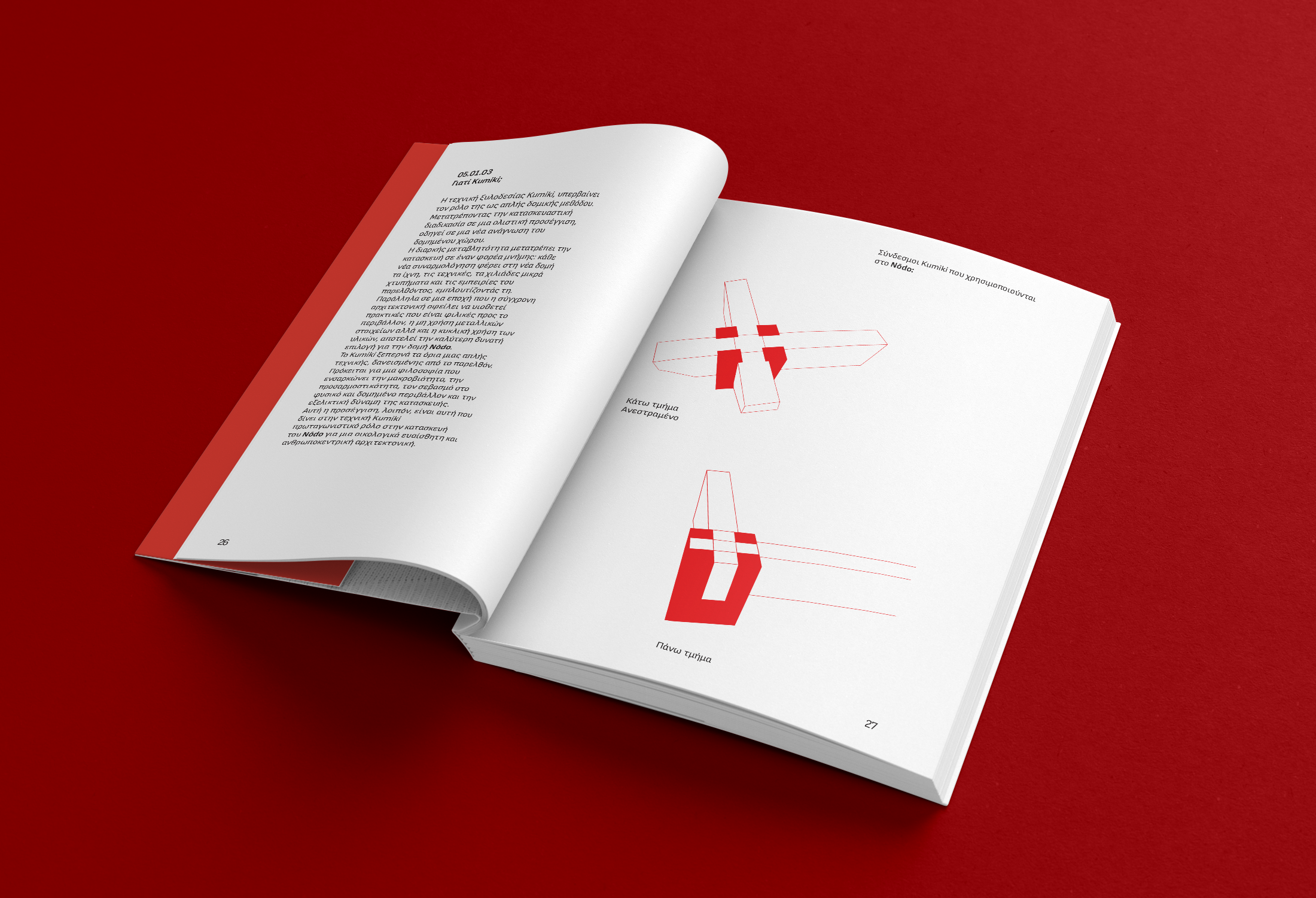
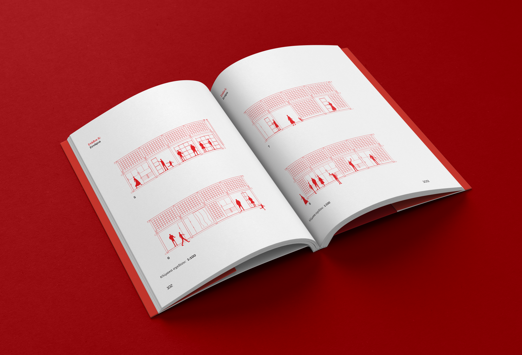
For the Nodo diploma thesis book, I developed the visual identity and editorial design, translating the project’s architectural language into a cohesive graphic system that reflects its values of the project.
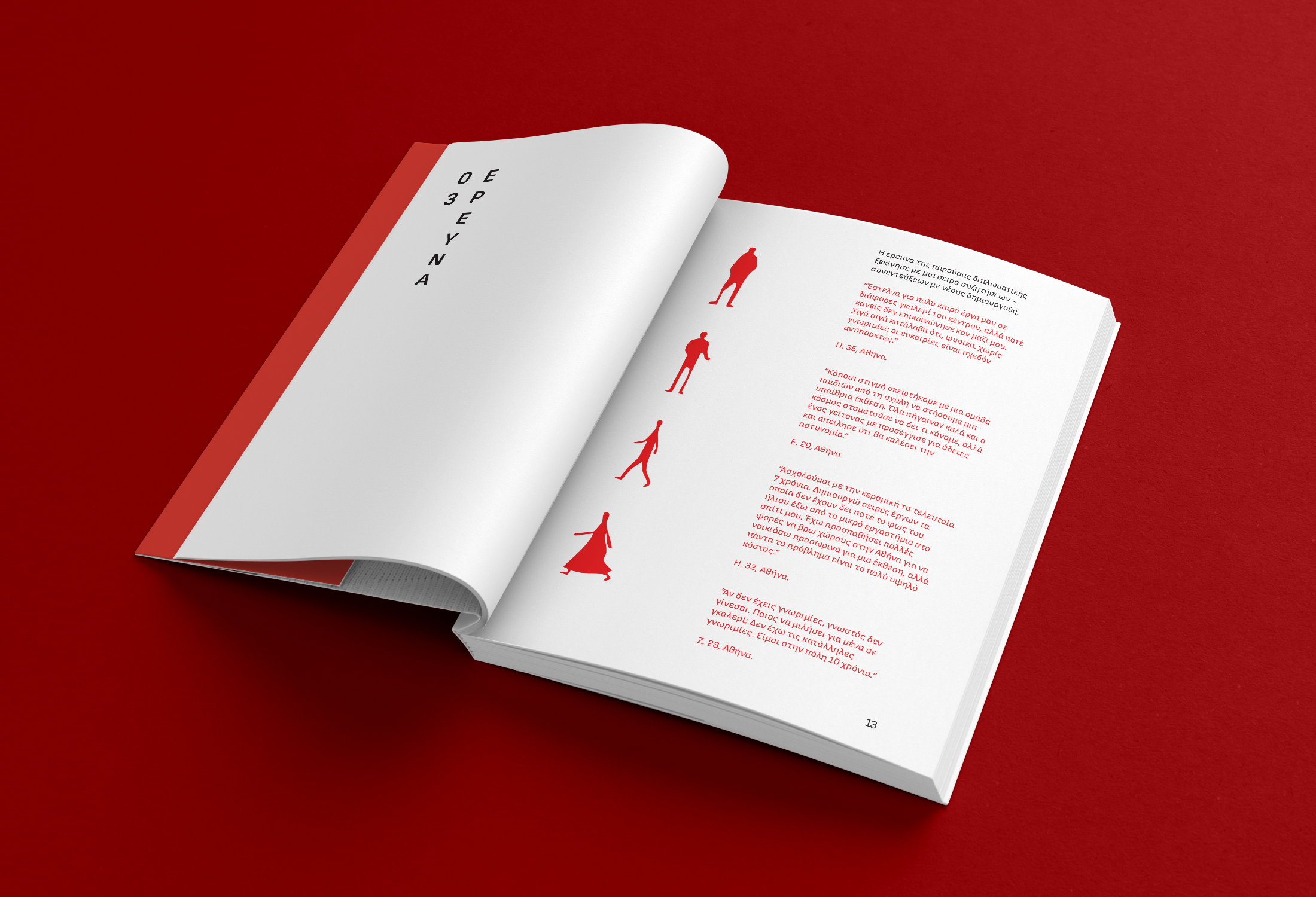
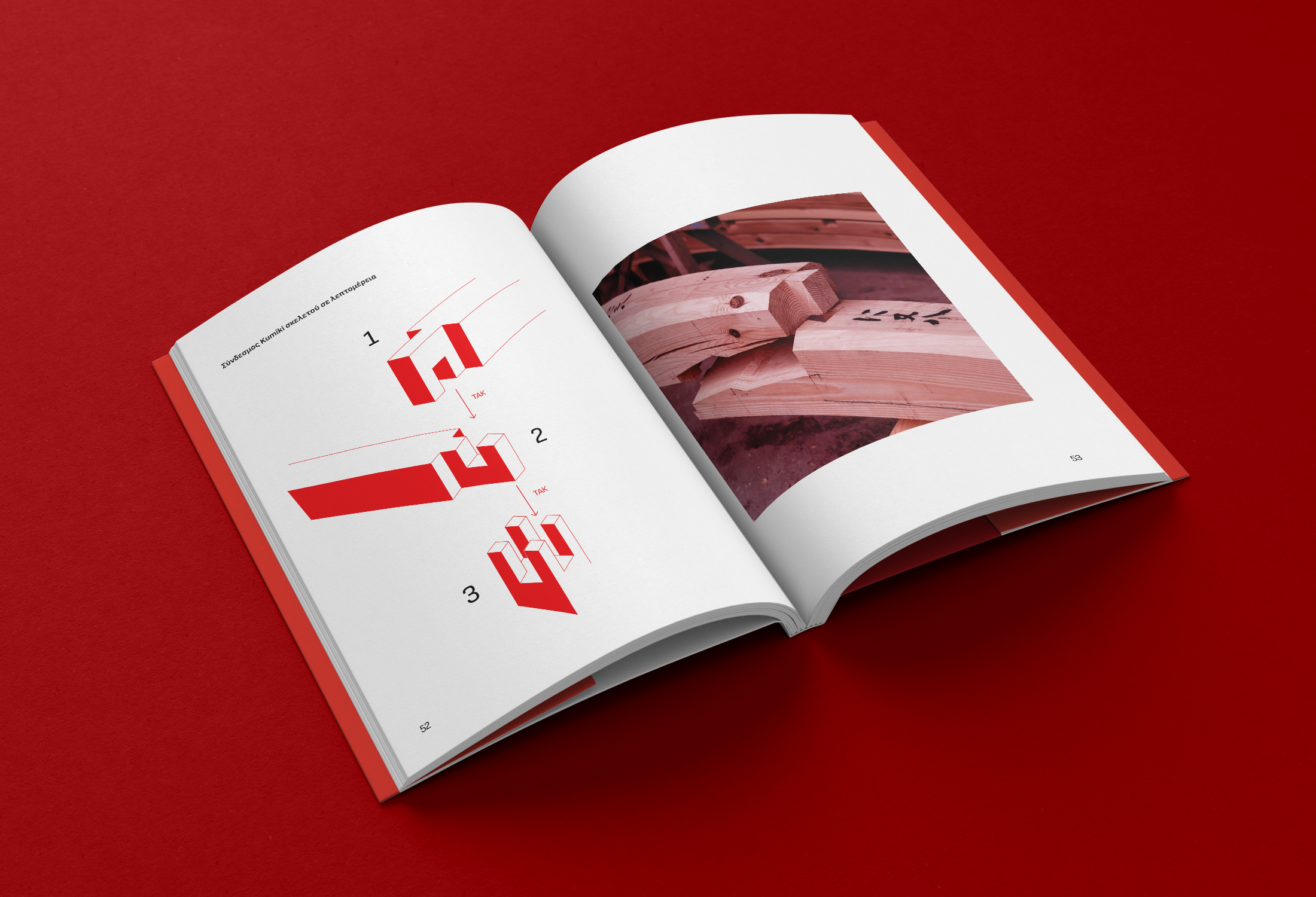
The entire book is designed around a monochromatic red palette, chosen as a symbolic reference to the two cultures that inspire the Nōdo project: Japan and Denmark. Beyond symbolism, the colour introduces energy and a strong presence, contrasting with the minimal and calm structure of the rest of the book.
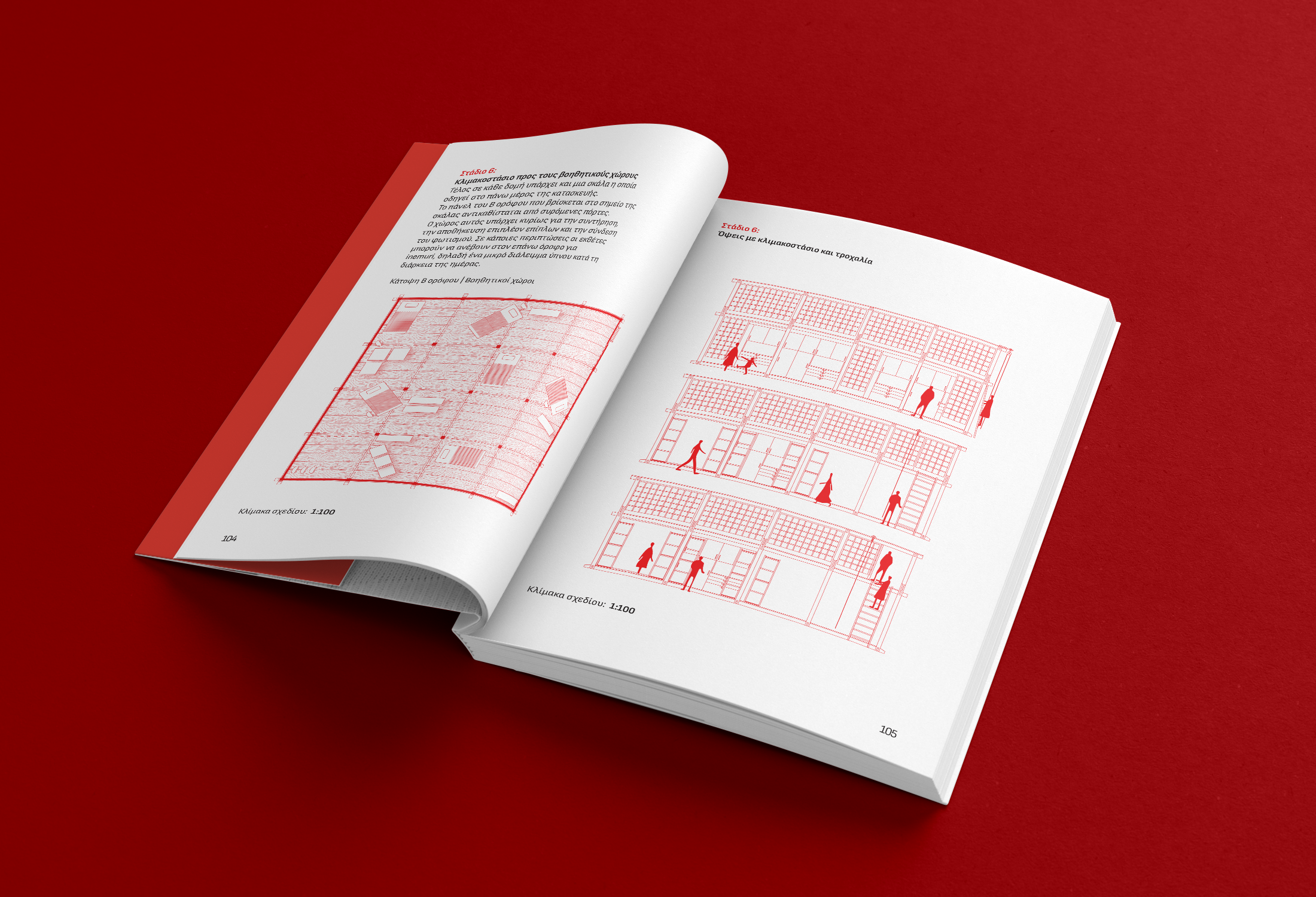
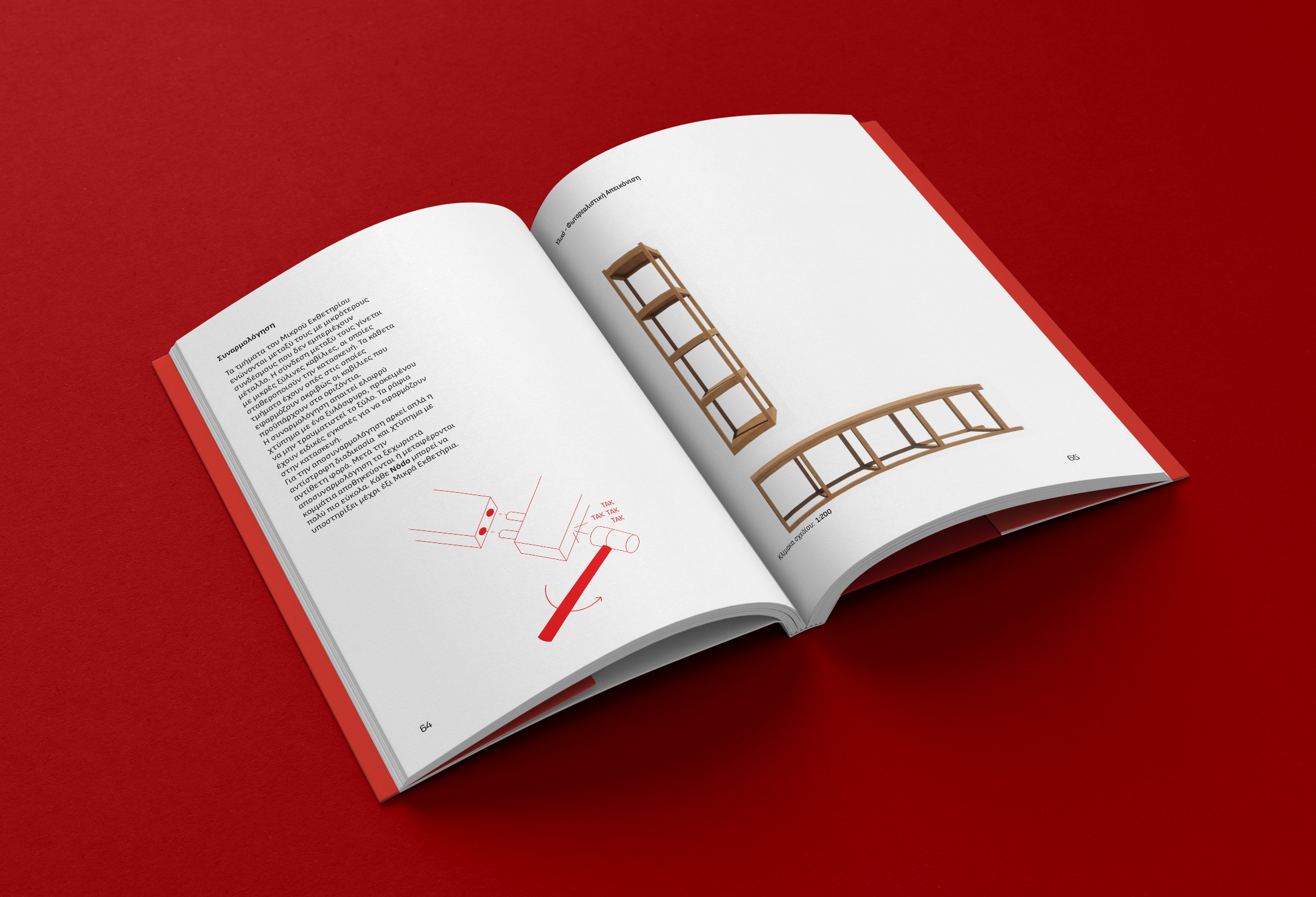
The layout is built upon a minimal left-aligned structure, supported by a strict grid system that creates consistency while allowing flexibility. Strong vertical and horizontal guides organize the content and establish a clear visual rhythm throughout the book. These guides act as an underlying framework, occasionally becoming visible through intentional spatial breaks and empty areas that create moments of pause. Instead of treating empty space as unused, the layout considers it an active element that allows the content to breathe and encourages a slower, more thoughtful reading experience. Large areas of emptiness highlight important images, texts, and architectural details, creating a hierarchy that guides the viewer naturally through the narrative.
The relationship between structure and openness mirrors the architectural concept of Nōdo itself: a flexible system that can constantly adapt, transform, and create new interactions. Typography, scale, and placement are carefully controlled to establish a clear visual sequence, while subtle shifts in composition introduce moments of discovery and movement.
Through restraint, clarity, and intentional composition, the book becomes an extension of the architectural proposal—a visual environment where structure and spontaneity coexist, reflecting Nōdo’s ambition to transform everyday urban passage into a space for connection and experience.