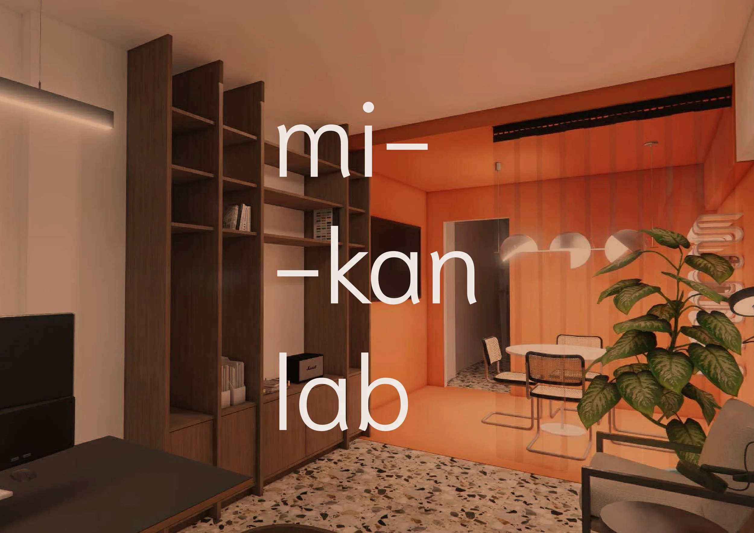
Mikan Lab | branding + signage
architecture office | 2026
Mikan Lab is an architectural studio founded by a young architect with the ambition of introducing a fresh perspective to a traditional Greek city. The goal was to create a visual identity that reflects her contemporary approach while remaining approachable and memorable within the local context.
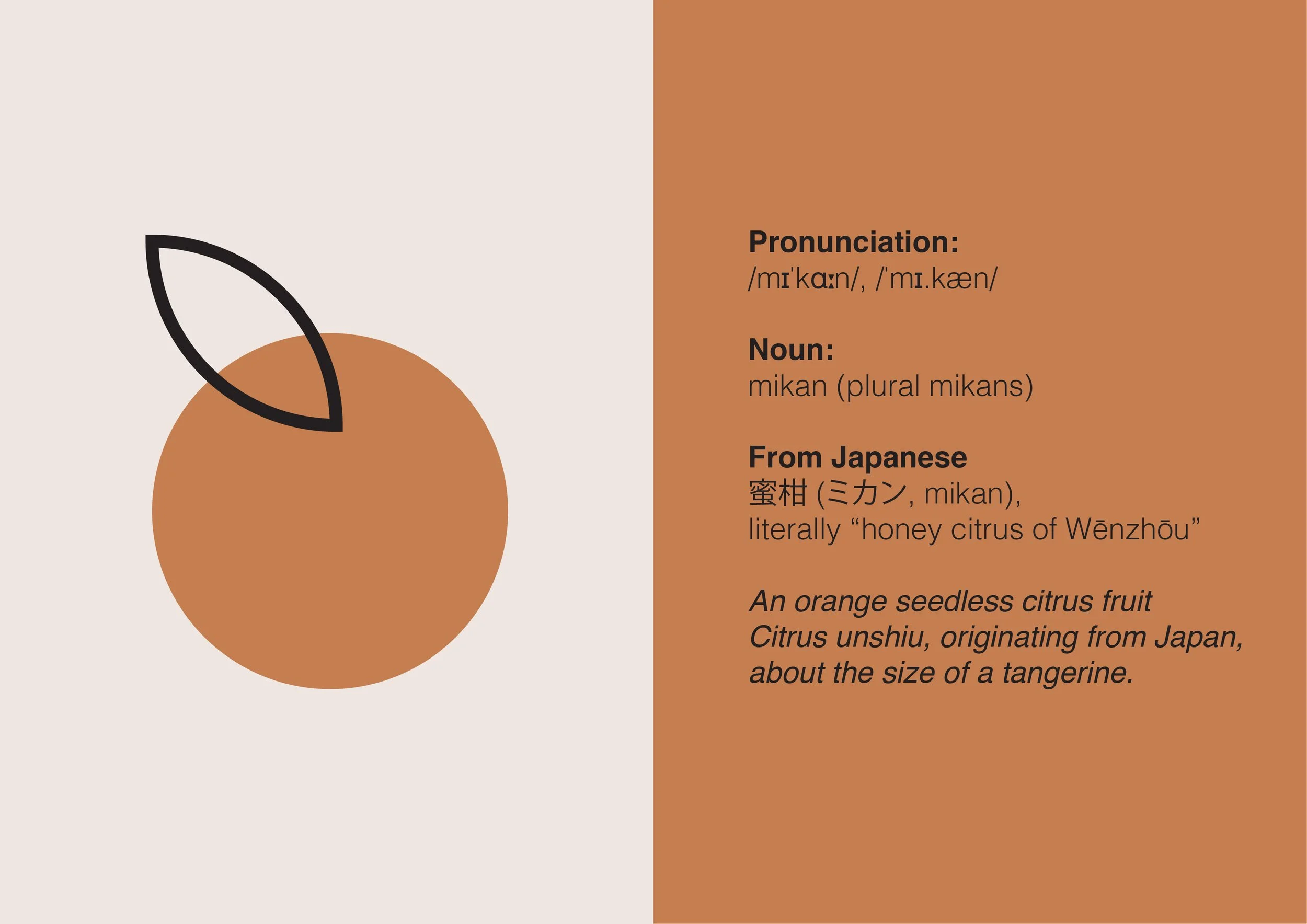
Drawing inspiration from Japanese aesthetics and mid-century modern design, the brand balances minimalism with warmth and character. At the heart of the identity is the mikan, the Japanese citrus fruit, which serves as the primary symbol, representing freshness, optimism, and new beginnings.
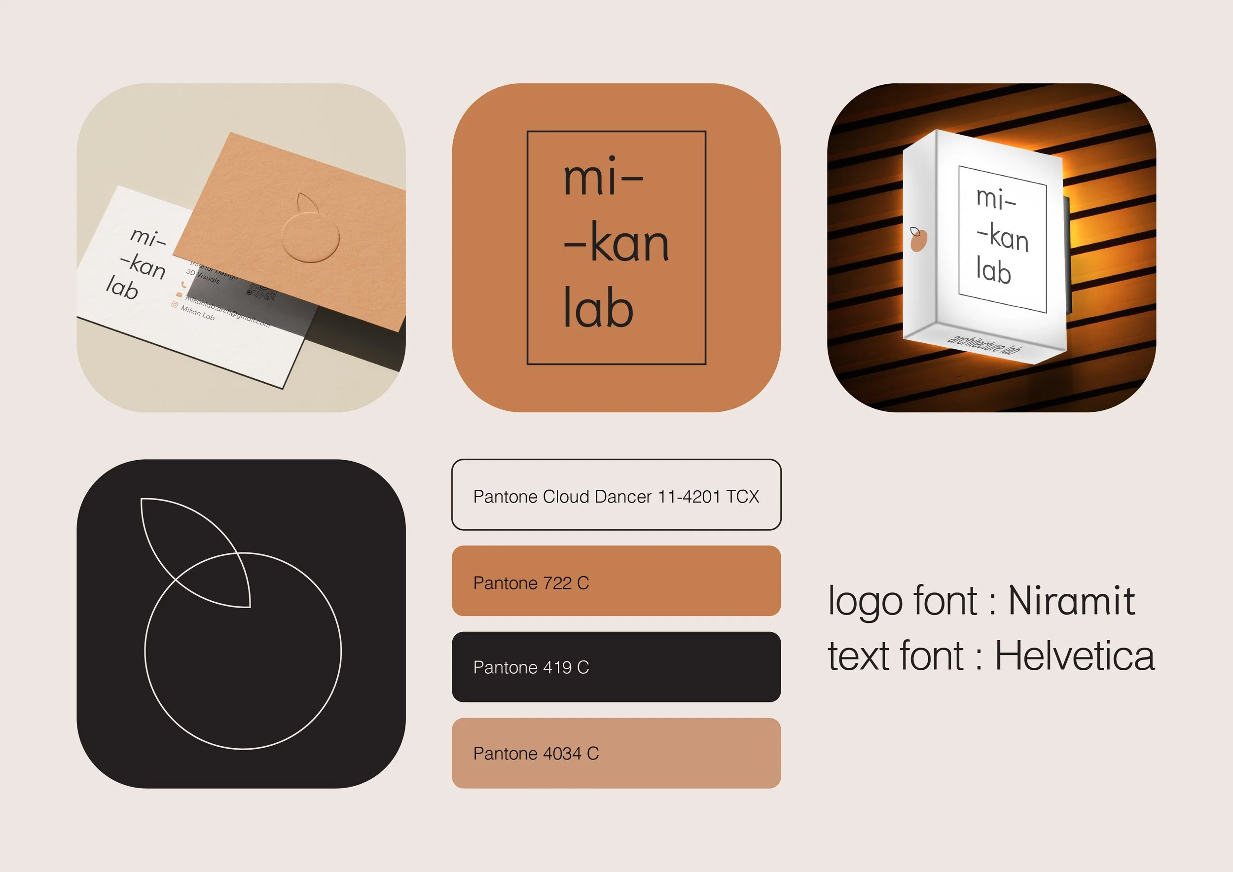
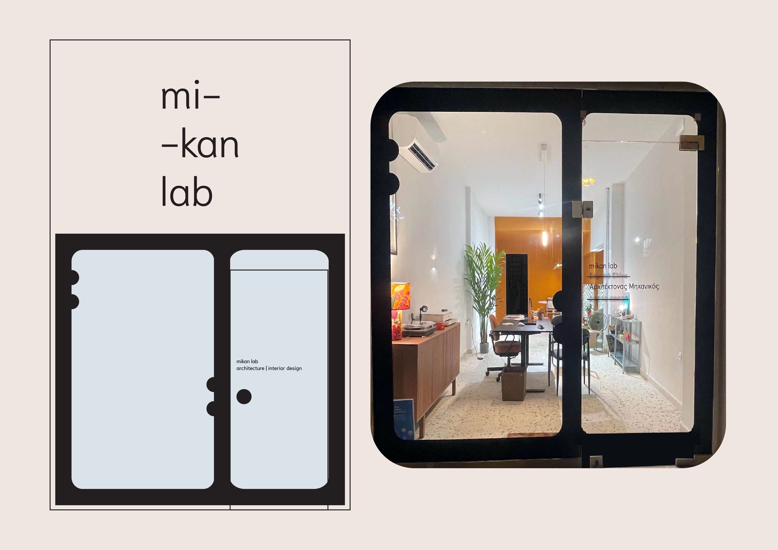
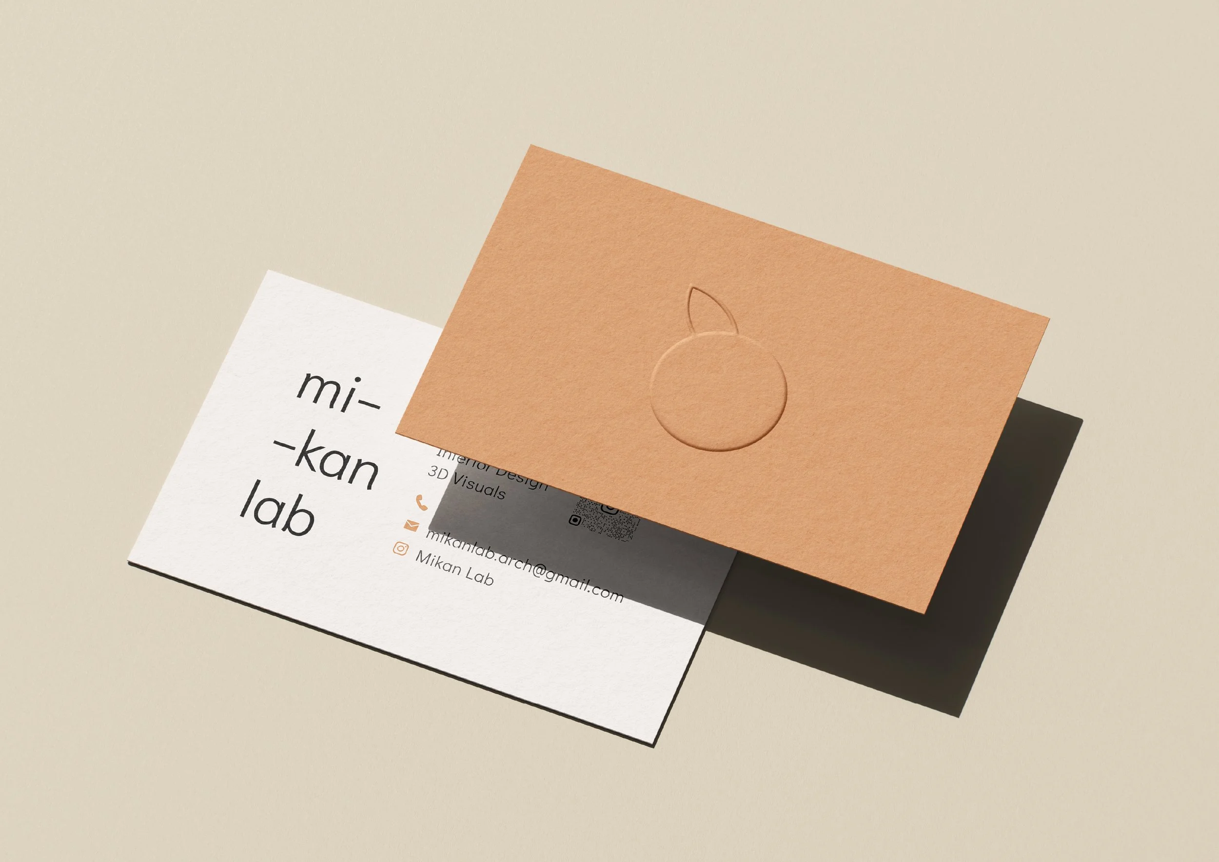
The vibrant orange color palette was intentionally chosen to create a bold visual presence, adding a distinctive pop of color to the neighborhood and reinforcing the studio's confident, forward-thinking personality and enhance the existing orange elements of the interior, chosen by the architect. Clean typography, restrained layouts, and thoughtful details complete a system that feels both timeless and expressive.
The result is a visual identity that communicates the architect's vision: contemporary, minimal, and refreshingly different—an invitation to experience architecture through a new lens.